Formula map
Colour-code the sheets you choose and see how a spreadsheet is built, without opening formulas one at a time.
Apply the map
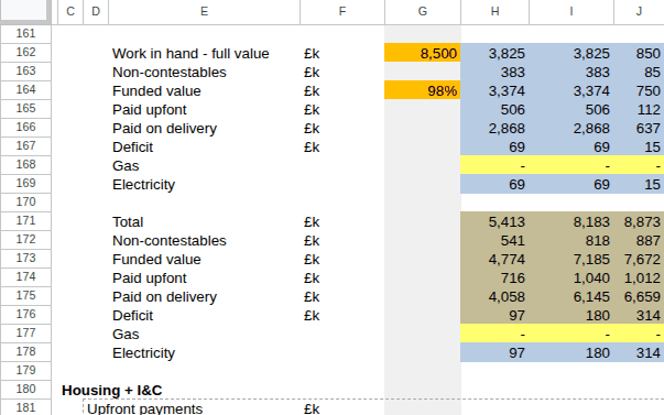
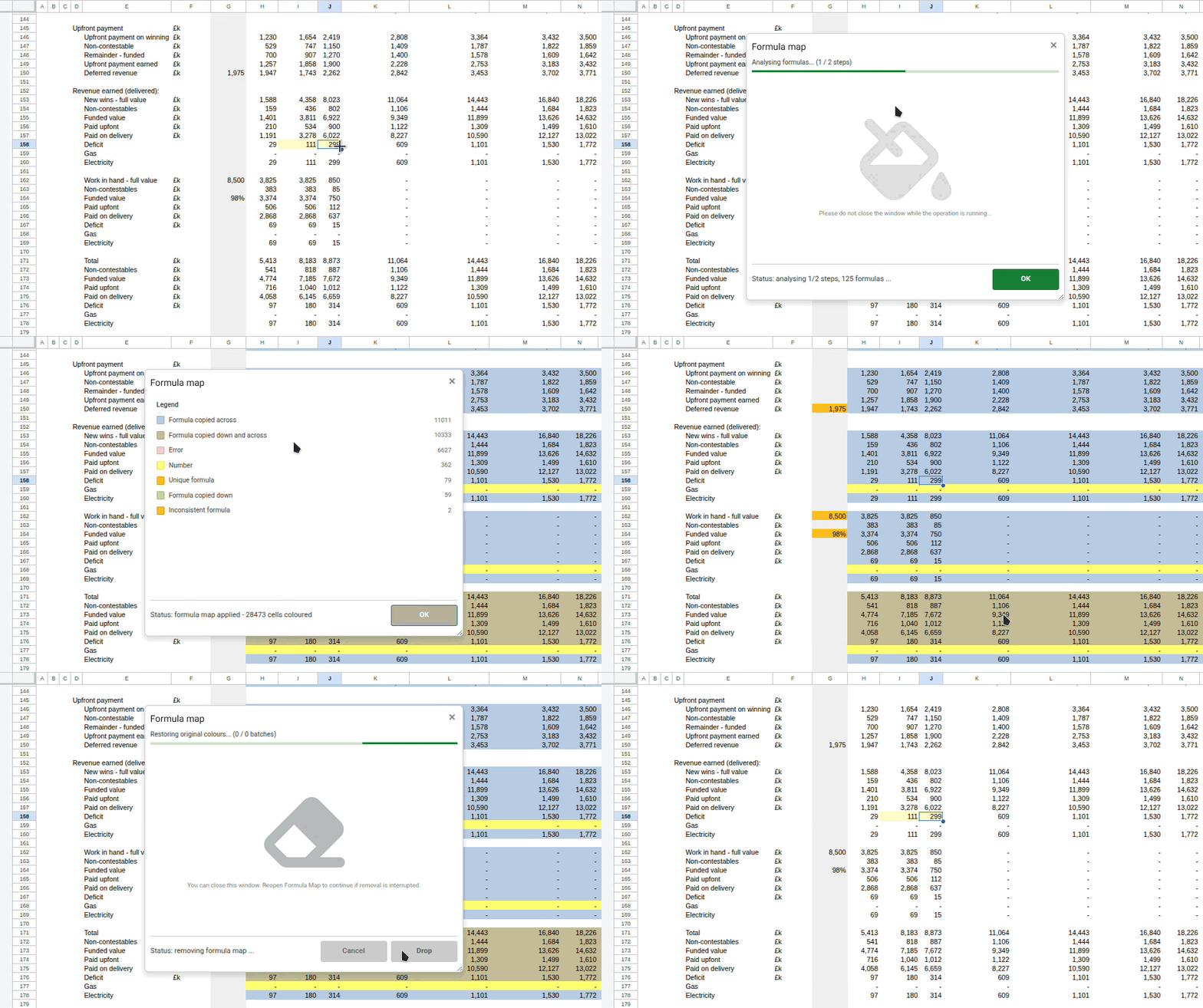
Press Alt + Shift + Q, choose the sheets you want analysed, and apply the map. Every cell is coloured by what it is: a formula copied down, across or both ways, a one-off formula, a hardcoded number, a text label, a Boolean, a data validation input, or an error.
While the map is active an icon sits next to the Formula Explorer icon. Click it to reopen the legend, check which sheets are mapped, or remove the map. Which categories you show, and the colour each one gets, are set in Settings.
What the colours mean
A short worked example, mapped with the default palette.
| A | B | C | D | E | |
|---|---|---|---|---|---|
| 1 | Q1 | Q2 | Q3 | Total | |
| 2 | Units | 120 | 135 | 148 | =SUM(B2:D2) |
| 3 | Revenue | 1,140 | 1,283 | 1,443 | =SUM(B3:D3) |
| 4 | Cost | 900 | 1,010 | 1,120 | =SUM(B4:D4) |
| 5 | Gross | =B3-B4 | =C3-C4 | =D3-D4 | =SUM(B5:D5) |
| 6 | Overhead | 150 | 150 | 150 | =SUM(B6:D6) |
| 7 | Net | =B5-B6 | =C5-C6 | =D5-D6 | =SUM(B7:D7) |
| 8 | Margin | =B7/B3 | =C7/C3 | =D7/B3 | =SUM(B8:D8) |
Column E is one formula copied down, so it reads as a single band. Rows 5, 7 and 8 were copied across. The inputs are yellow. D8 divides by the wrong row, which breaks the pattern its neighbours establish, so it is flagged rather than left to blend in. Column A stays uncoloured because text labels are switched off by default.
Formulas
Cell contents
References
Flags
Every colour can be changed and every category can be switched off, in Settings. Unique formula and inconsistent formula share a colour out of the box; give them separate ones if you want to tell them apart at a glance.